WELCOME TO OUR NEW BRAND
COMMUNICATION GUIDELINES
WILSON DOW GROUP VS. WILSON DOW
When referencing Wilson Dow Group to external audiences or in written public-facing materials, always begin by referencing our business as “Wilson Dow Group.”Following mentions of the name may be shortened to “Wilson Dow,” especially in paragraph format. See example below:
PR BOILERPLATE
Wilson Dow Group designs and delivers experiences that harness the Power of Live™ by uniting and activating audiences – whether in person, virtual, or somewhere in between. Fueled by strategy, creativity, and a data-driven understanding of industry trends, Wilson Dow has created meaningful outcomes for leading brands looking to engage, prepare, and inspire their most coveted audiences for over 27 years. The company achieves this through an integrated approach of live experiences, ongoing communication plans, and experiential learning, supported by a 100+ staff of highly tenured and talented professionals based in Chicago, New York, San Francisco, and beyond. For more information, visit wilsondow.com.
In all legal documentation, refer to the company as “Wilson Dow Group.” While we understand internal teams may shorten the company name in peer-to-peer messages, “WDG” is not to be used in any written external communications.
OXFORD COMMA
Please use the Oxford comma in all brand documents, keynotes, and written materials.
BRAND VOICE
PURPOSE
ENGAGE like-minded professionals, prospective clients, and industry leaders
AMPLIFY our work, our talent, and our people
EMPOWER prospects to believe in WILSON DOW and THE POWER OF LIVE™
PERSONA
Smart, creative problem-solvers
TONE
- AMUSING but not silly
- GENUINE but not self-important
- HONEST yet cautious (we don’t give away our secret sauce)
- WARM but not overly sensitive
- PLAYFUL but not campy
- APPROACHABLE yet professional
- ATTENTIVE to our industry and our role in society
WORDS WE LIKE
- Engage, Prepare, Inspire
- #thepoweroflive
- #wilsondowway
- #wilsondow
- #wilsondowgroup
- #wilsondowgives
- #liveevents or #liveevent
WORDS WE DON’T LIKE
- All hashtags that are not listed above
and more than three hashtags per post
(examples include #brandstorytelling, #live, #fullsentencesthatarehardtoread, etc.) - Excessive and superfluous adjectives describing our work and capabilities
- Live brand storytelling
- We power brand experiences
- Experiential marketing agency
- “WDG” or “WD”
LOGO & USAGE
The WILSON DOW logo celebrates the fundamentals the company was founded on and embraces modern, forward-thinking design. It reflects a culture that is creative, strategic, and fun. The logo, brand mark, and tagline were crafted with a clean, versatile typeface with a robust and vibrant color identity, with acute, future-forward positioning. Onward and upward!
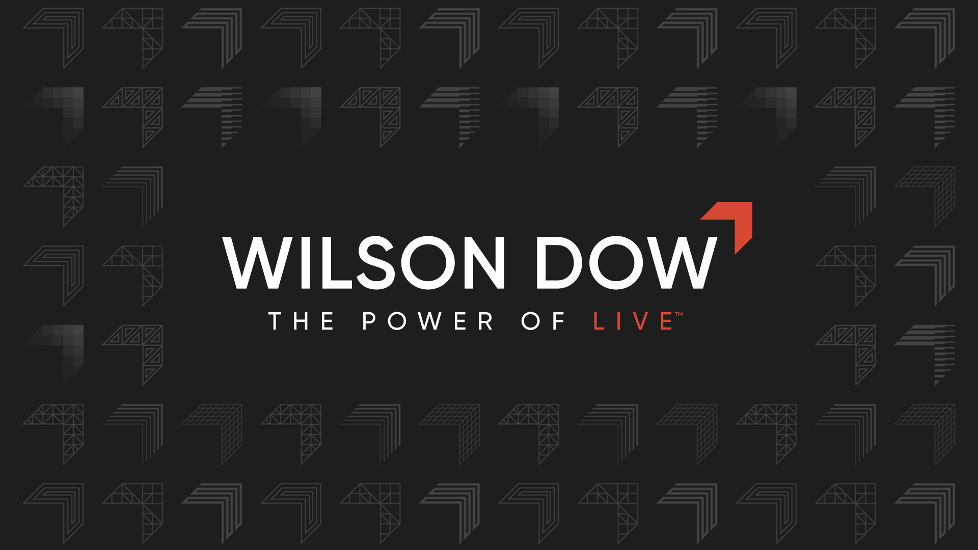
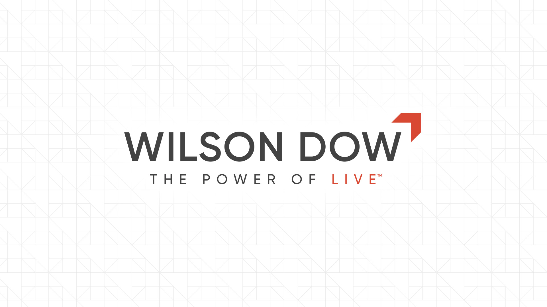
The full color use of our logo above uses the colors Shadow and Wilson Dow Orange. It is intended to be used on white, neutral, or light backgrounds and images.
The white with color version is a reverse logo using white and Wilson Dow Orange for use on Shadow-colored backgrounds or dark images.
The knockout logo on a black background is to be used only when full color is not an option. Black logo on a white background is also acceptable only when full color is not an option.
LOGO & USAGE: TAGLINE
Our tagline represents the power of shared experience, a concept that drives our business and leads our unique differentiation in the industry.
We trademarked THE POWER OF LIVE™ as a message about our offering: live experiences. Wherever possible, the logo should appear with the tagline. Do not use in confined areas where the text becomes illegible.
Full Color
The full color use of our logo above uses the colors Shadow and Wilson Dow Orange. It is intended to be used on white, neutral, or light backgrounds and images.
White with Color
The primary version is a reverse logo using white and Wilson Dow Orange for use on Shadow-colored backgrounds or dark images.
Knockout Logo
White logo and tagline on a black background is to be used only when full color is not an option. Black logo and tagline on a white background is also acceptable only when full color is not an option.
OUR BRAND MARK & USAGE
Our brand mark – the WILSON DOW Chevron – reflects our future-oriented mindset. The Chevron base shape from the logo has been filled with various patterns to make new accent elements. The larger chevron designs have more complex shapes and can be used to fill slide backgrounds or more prominent design elements. Each chevron also has a simplified version where the patterns maintain visibility at a smaller scale.


CONSTRUCTION & CLEAR SPACE
The WILSON DOW logo requires separation from other elements around it. The space required on all sides is equivalent to the width of the chevron as a part of the logo. The clear space area must not be interrupted by other graphic elements that could hinder legibility of the brand.
Full WILSON DOW logo. For whatever size the chevron may be, the clear space should be exact same sizing around the logo and tagline.
Full WILSON DOW logo with tagline. For whatever size the chevron may be, the clear space should be exact same sizing around the logo and tagline. The clear space between the tagline and logo should equal 1/3 the height of the chevron.
WILSON DOW chevron with text: For whatever size the chevron may be, the clear space should be exact same sizing around the chevron. Cap height should fit within the crux of the chevron clear space.
PRIMARY TYPEFACE
Gilroy
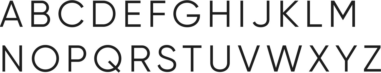

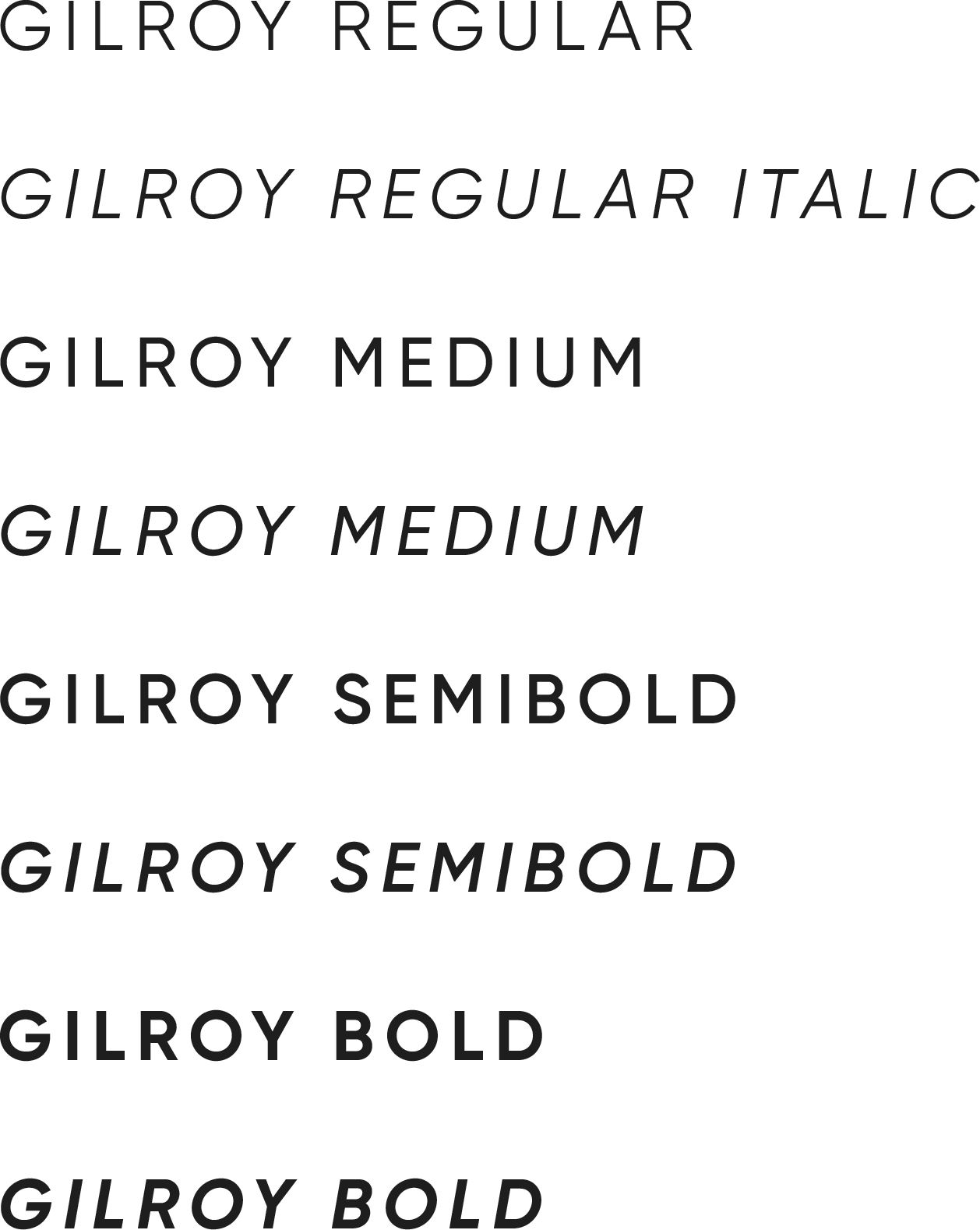
ABOUT THE FONT
Gilroy is a modern sans serif with a geometric touch. A younger brother of the original Qanelas font family, it was designed with powerful opentype features in mind. This font comes in 20 weights: 10 uprights and their matching italics. Each weight includes extended language support (+ Cyrillic), fractions, tabular figures, arrows, ligatures, and more.
The Gilroy font family should be used in all presentation and marketing materials and has many weights and options to allow for multiple levels of typographic hierarchy. Employees can download and install the Wilson Dow corporate fonts by clicking below. These fonts must be installed and activated to properly view our templated materials.
SECONDARY TYPEFACE
Integral CF Bold
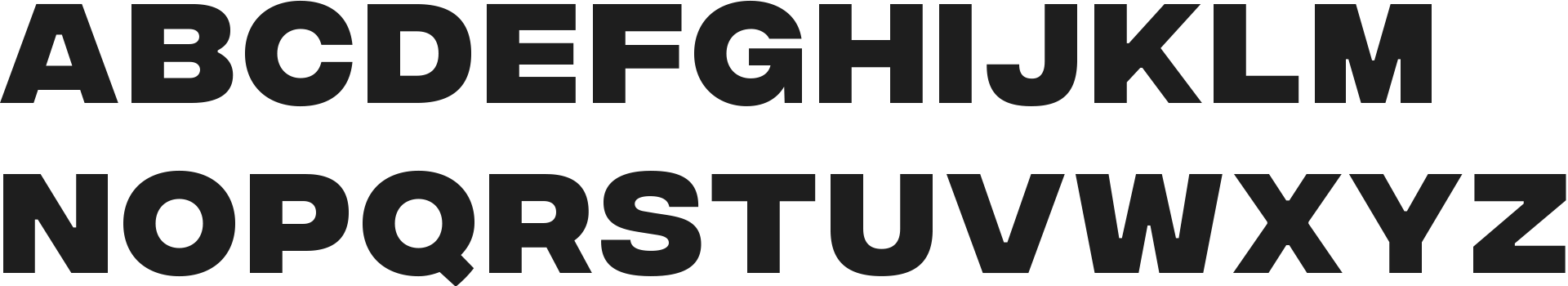

ABOUT THE FONT
Integram CF Bold is designed for maximum visual and emotional impact. Hidden among the straight lines and corporate confidence is a hint of roguish charm and character; Integral lends your words a strong voice while being lot of fun to use.
This secondary font is used alongside the Gilroy family for select headline or display content in presentations and other marketing materials.
Web Typography
Montserrat Extra Bold
A B C D E F G H I J K L M N O P Q R S T U V W X Y Z
a b c d e f g h i j k l m n o p q r s t u v w x y z
1 2 3 4 5 6 7 8 9 0 ! ” § $ % & / ( ) = ? + * #
Montserrat Normal
A B C D E F G H I J K L M N O P Q R S T U V W X Y Z
a b c d e f g h i j k l m n o p q r s t u v w x y z
1 2 3 4 5 6 7 8 9 0 ! ” § $ % & / ( ) = ? + * #
ABOUT THE FONT
The Montserrat family of fonts should be used for web and digital communications.
It is a best practice to PDF any document you are sending to clients and outside vendors. If your editable working documents are to be shared externally, you must replace Gilroy and Veneer Clean typefaces with the Helvetica font. This is particularly important to remember, because Wilson Dow’s primary fonts might not be installed on a system outside of the company and could be rendered illegible.
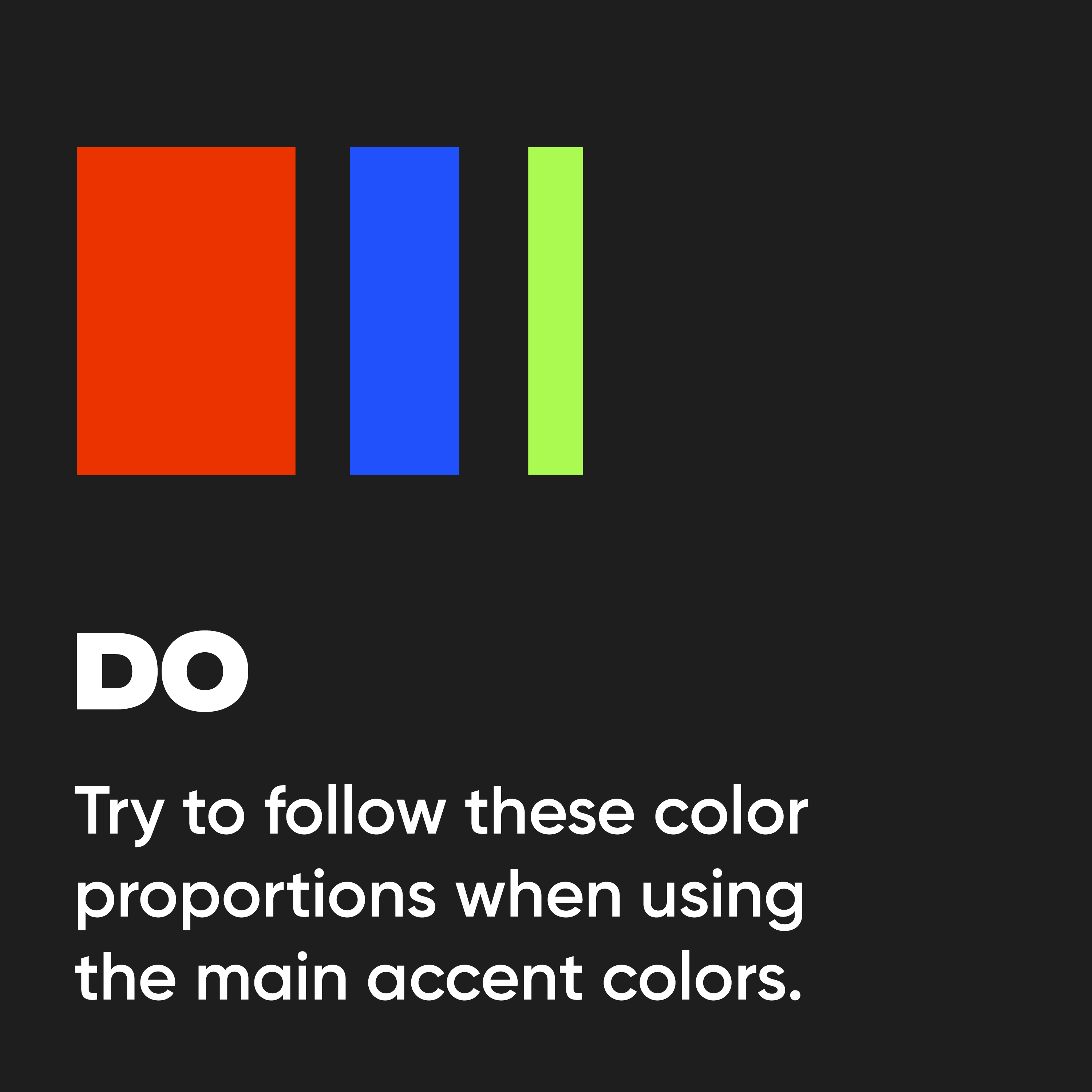
PRIMARY COLOR PALETTE
The RGB color palette serves as a powerful tool, allowing us to create a diverse range of emotions and experiences across various platforms. From the vivid hues in our digital presence to the precise tones in our printed materials, our brand is a visual journey that resonates with a contemporary and forward-thinking audience.
Wilson Dow Orange
RGB: 235, 52, 0
CMYK: 0, 78, 100, 8
HEX: #EB3300
PMS: 2028 C
Sapphire
RGB: 32, 81, 250
CMYK: 87, 68, 0, 2
HEX: #2051FA
PMS: 2132 C
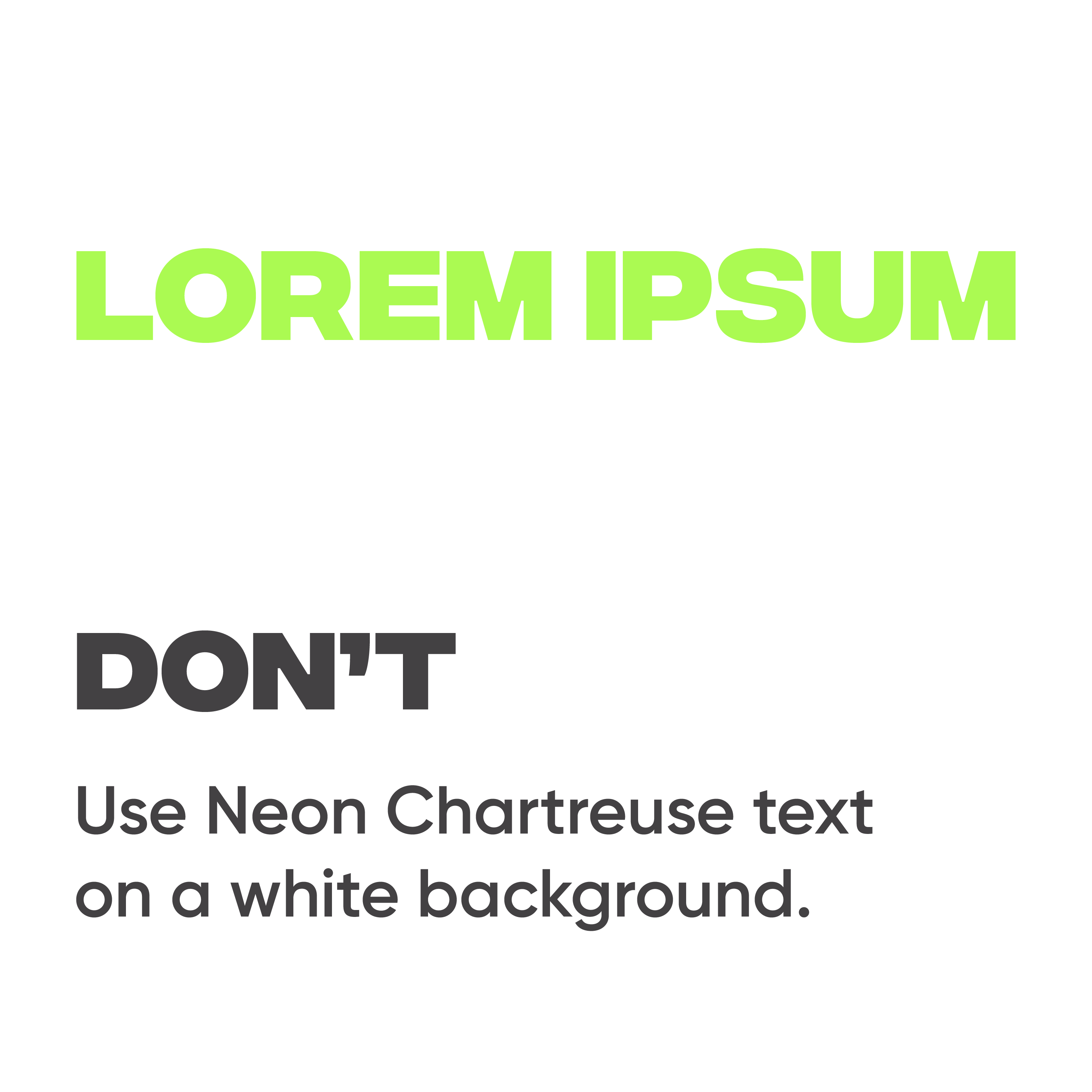
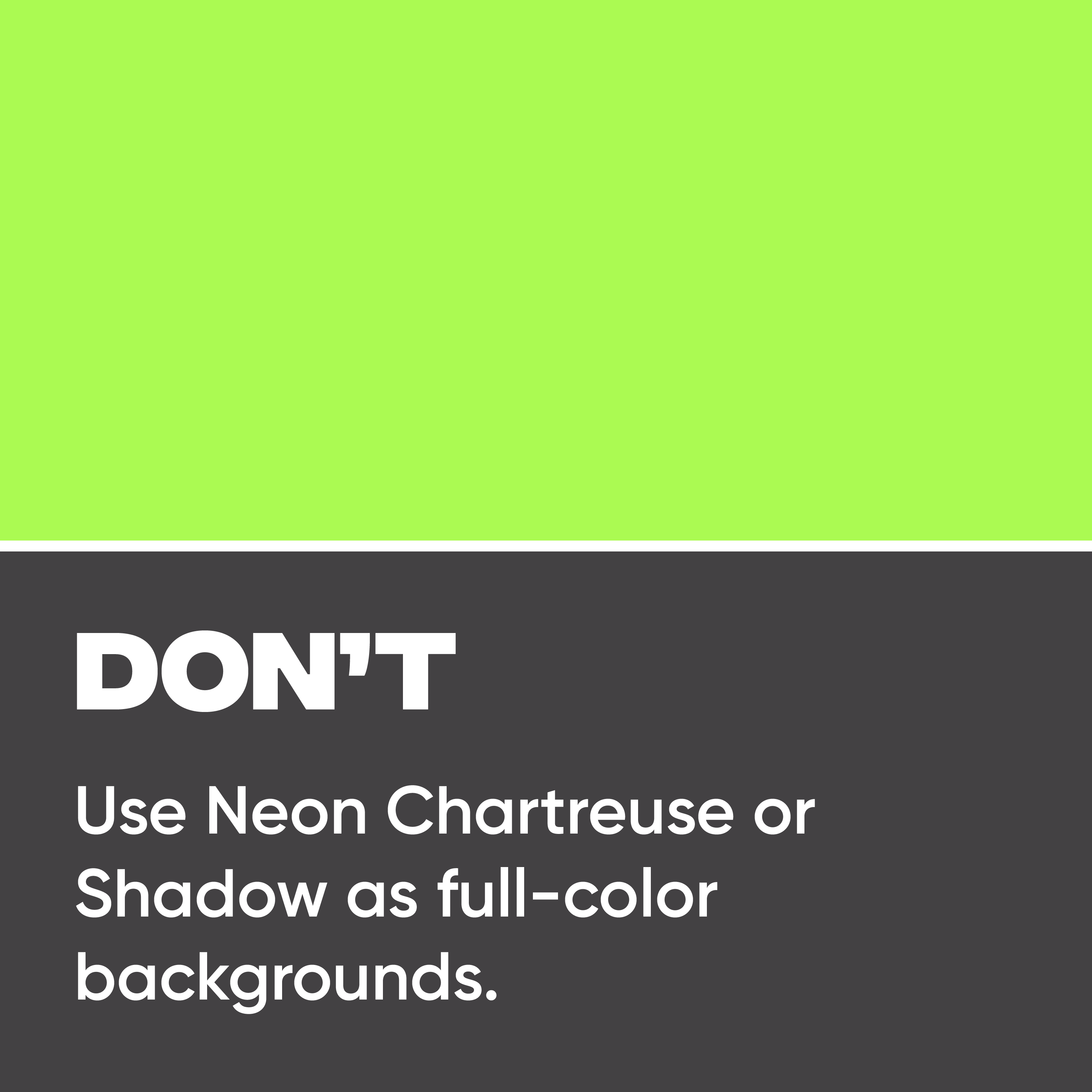
Neon Chartreuse
RGB: 171, 250, 82
CMYK: 32, 0, 67, 2
HEX: #ABFA52
PMS: 2283 C
Shadow
RGB: 67, 65, 67
CMYK: 0, 3, 0, 74
HEX: #434143
PMS: 419 C
Misty Silver
RGB: 192, 192, 192
CMYK: 0, 0, 0, 25
HEX: #C0C0C0
PMS: 428 C
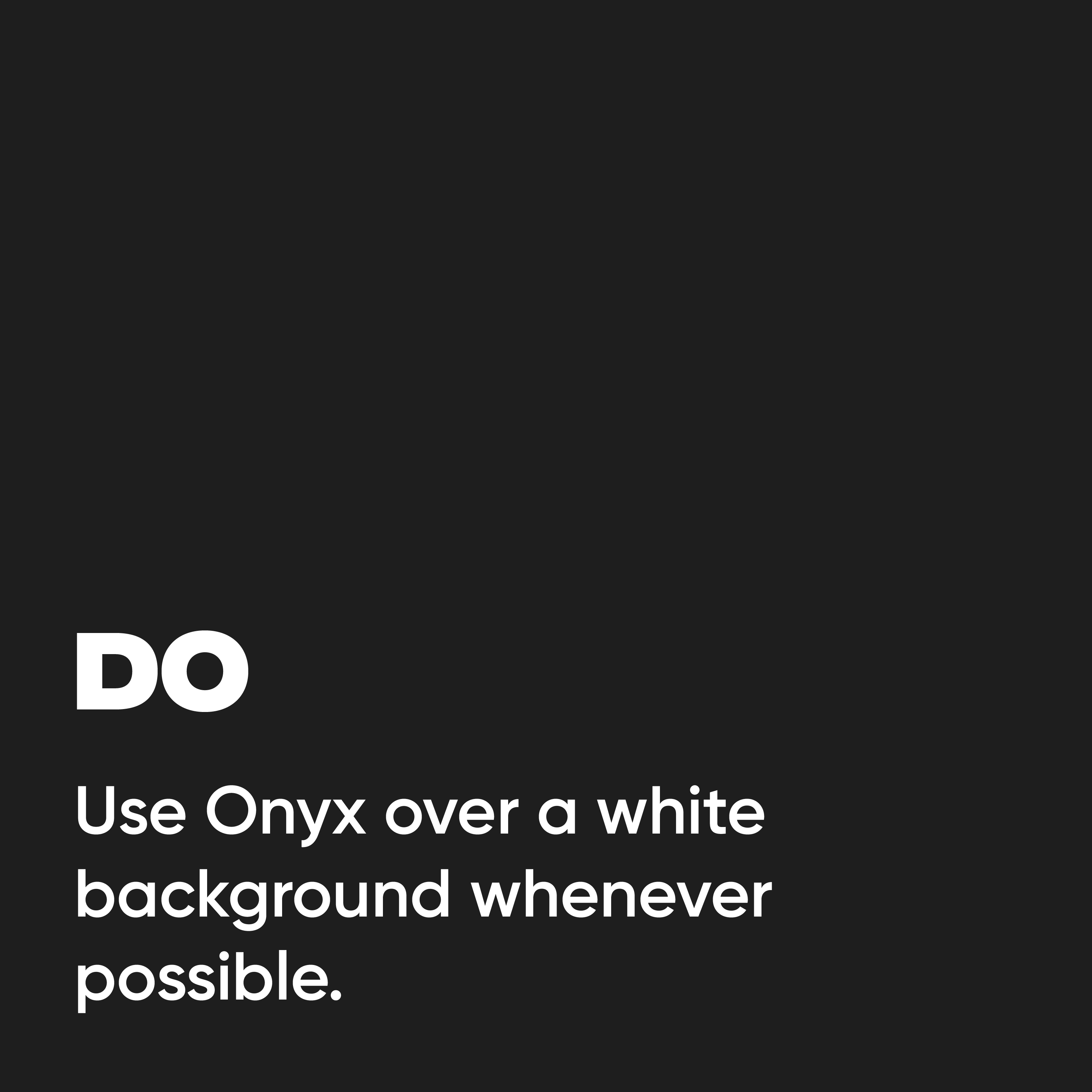
Onyx
RGB: 30, 30, 30
CMYK: 0, 0, 0, 96
HEX: #1E1E1E
PMS: 419 C
AUXILIARY COLORS
For use on charts, graphs, emails, or other instances where extra colors may be needed to identify content/data.
Sky
RGB: 20, 191, 250
CMYK: 64, 5, 0, 0
HEX: #14BFFA
PMS: 2995 C
Amethyst
RGB: 82, 12, 207
CMYK: 60, 94, 0, 19
HEX: #520CCF
PMS: VIOLET C
Power of Live Pink
RGB: 255, 0, 85
CMYK: 0, 87, 49, 0
HEX: #FF0055
PMS: 1785 C
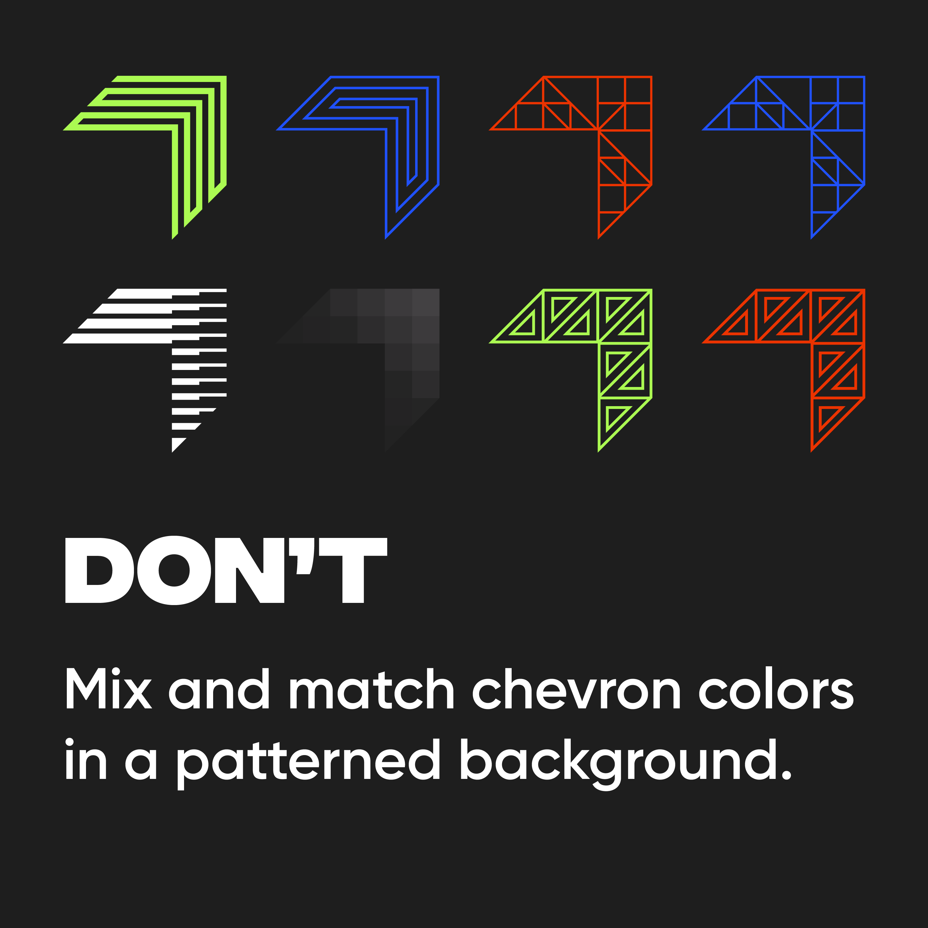
PATTERN
Our chevron patterns are inspired by the functional beauty of blueprints, floor plans, and tools that require attention to detail and precision. It reflects our excellence in strategic planning and creative vision. These nine patterns can be used for backgrounds and other design elements outside the chevron shape.


PHOTOGRAPHY
Photos artfully blend subject matter, tone, lighting, colors, composition, and emotion to speak to an audience without saying a word.
We strive for photography that’s capable of authentically speaking to, and connecting with, our audience. Take into consideration the audience, age, demographics, product brand, and the medium in which the image will be used when selecting photos. With those factors in mind, choose photos of real people in real situations.
Through depth of field and use of action shots, the viewer will feel present and engaged in the subjects’ activities. The tone of our preferred photography is warm, inviting, and emotive, and makes viewers feel as though they are natural witnesses to a life moment. While there is some flexibility in style and tone of imagery and design to achieve the objectives of the communication or campaign, selected imagery and design must not create dissonance with the WILSON DOW brand.


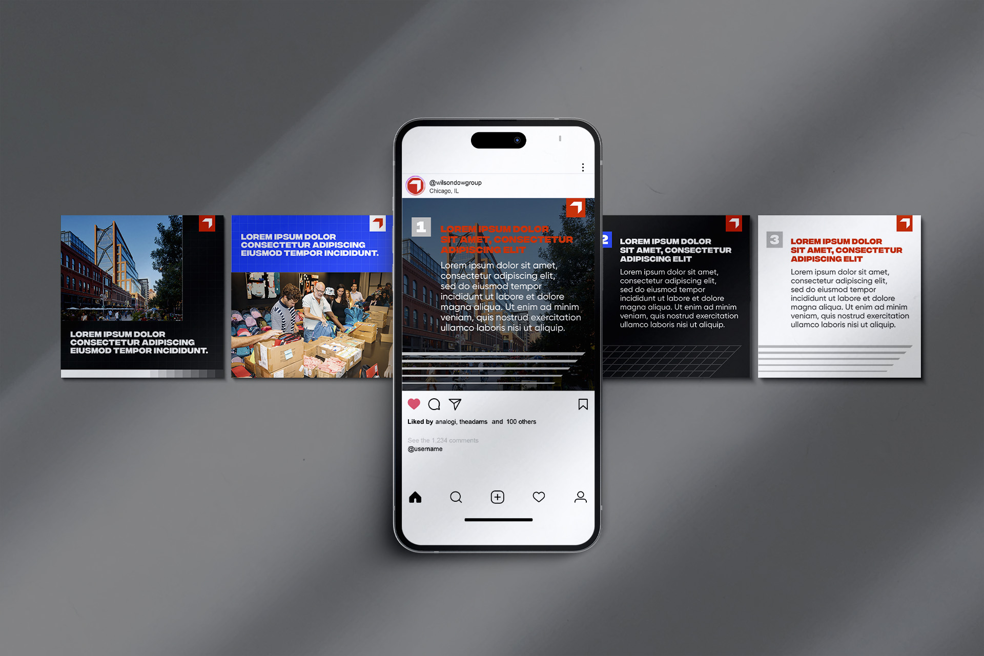
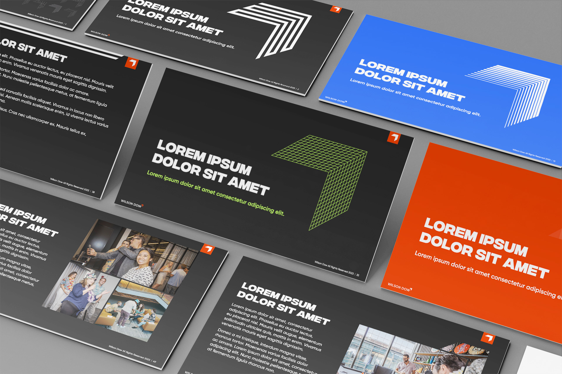
IN ACTION